


背景
element plus的多选功能实现手动添加一个el-table-column,设 type 属性为 selection,展现的表格样式如图1;单选功能实现需要配置 highlight-current-row,展现的表格样式如图2。理想很美好,现实很残酷啊,跟产品要的效果差距较大,产品想要实现效果如图3。本文主要讲解如何在多选功能的基础上实现第一列是单选框的单选功能。
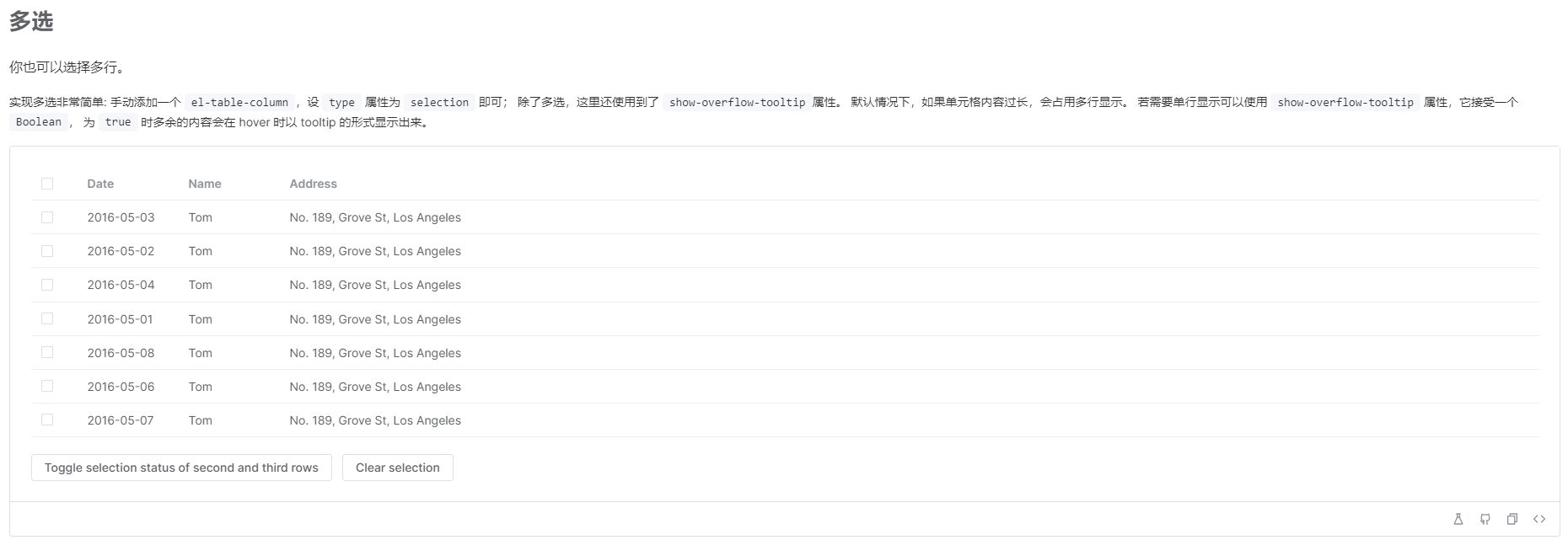
图1
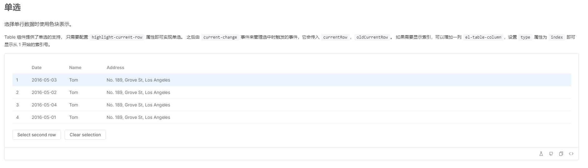
图2
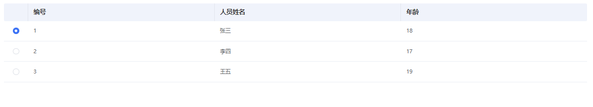
图3
实现
1.单选样式
1)生成多选列,并且增加单选标识,例如当radio为true时,为单选列。
<el-table-column v-if='radio' type='selection' width='54' :selectable="handleSelect"></el-table-column>
2)当radio为true时,增加单选类。
// 表头样式const headerCellClassName = () => { if (props.radio) { return 'cp-table__header-cell cp-table__header-cell-radio' } return 'cp-table__header-cell'}// 表内容样式const headerClassName = () => { if (props.radio) { return 'cp-table__cell cp-table__radio' } return 'cp-table__cell'}
3)修改单选功能时的多选框为单选框。
.cp-table { &__radio { /* 覆盖多选框的样式 */ .el-checkbox__label { display: inline-block; padding-left: 20px; } .el-checkbox__inner { width: 14px; height: 14px; border-radius: 50%; /* 使单选框有圆形按钮的形状 */ } .el-checkbox__inner::after { box-sizing: content-box; content: ""; position: absolute; top: 3px; left: 3px; transform: rotate(45deg) scaleY(0); transition: transform 0.15s ease-in 0.05s; transform-origin: center; width: 4px; height: 4px; background: #fff; border-radius: 50%; } } &__header-cell-radio:nth-child(1) .cell { display: none; }}
2.单选功能
1)给表格添加select事件。
@select="handleSelect"
2)当选择的数据大于1条时,将上次数据清空,并保留当次数据为勾选数据。
/** * @description: 单选 * @param {*} selection 选中数据 */ const handleSelect = (selection: any[]) => { if (selection.length > 1) { const tableDom = databaseRef.value // 选中表格 let delRow = selection.shift() tableDom.toggleRowSelection(delRow, false) // 取消上次数据的勾选 } // 保留当次数据为勾选数据 if (selection.length > 0) { listData.selectList = [selection[0]] } else { listData.selectList = selection }}
总结
至此,就可以实现表格的单选功能了,实现效果为:
1)单击数据选中,再次点击取消选中;
2)单击数据选中,单击其他数据,上次勾选数据取消选中,本次勾选数据选中;
